By O.A. CARRY FOR *67〡PUBLISHED: October 2nd, 2024
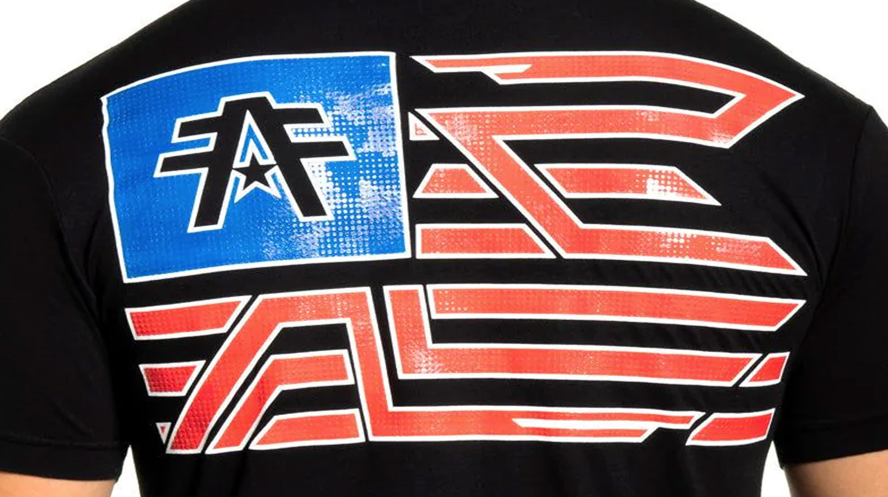
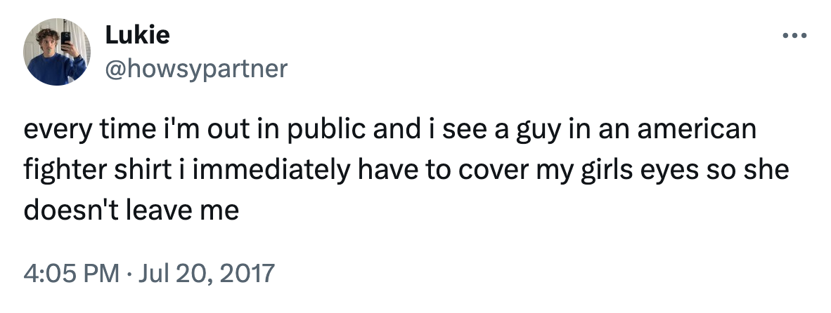
An American Fighter t-shirt featuring bold graphics and an athletic fit, perfect for those who embrace strength and individuality.
[work in progress]
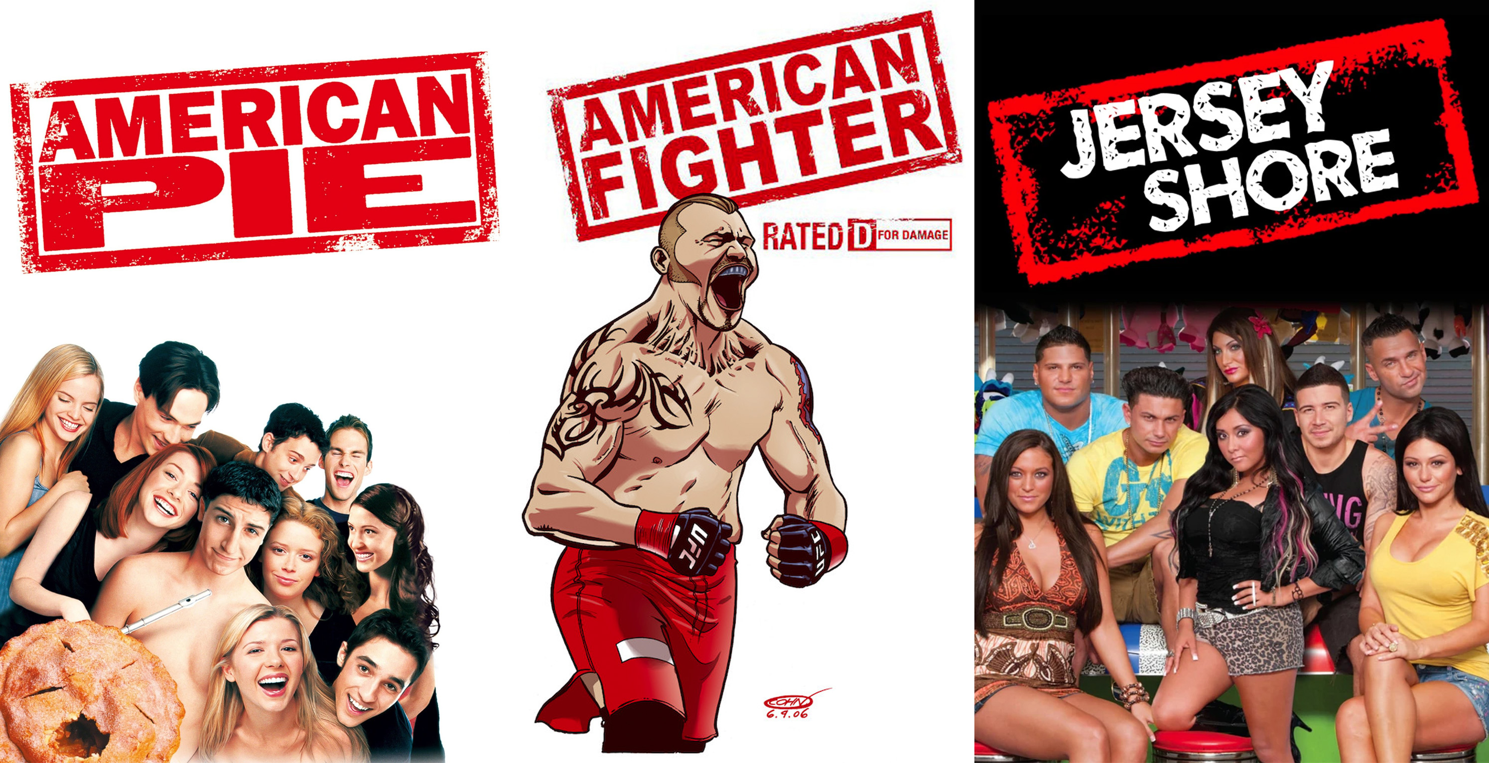
Yes, like any man who reaches their right age (their so-called “prime”), I’m rewatching Jersey Shore, specifically all of the seasons starting from the beginning, in successive order, from start to finish, sometimes binging three or four episodes a day, and taking notes, in an ongoing Notes app titled, T-Shirt Time 101. Yes, I’m making headway. Yes, it is extensive. No, you can not have the link.
The Cliffs Notes are this: Jersey Shore, as a late oughts and early 2010s cultural enterprise, are a defining nostalgic lighthouse that the captains of 2020s hipsterdom (at the decade’s beginning) saw in the distance, marking the shore (the Jersey Shore) that was ahead. The clothes are gaudy, loud and text-based. The busy cursive (almost Gaelic) fonts of each Christian Audigier or Armani Exchange piece are bedazzled, glistening gold sheens overtop wings, flowers and complex structures: line drawings, resembling tattoos, BDSM chains and the sexual peripheral sleep apparitions dissolving in the brain of a motorcycle gang’s leader (presumably). When fully imagined, these clothes are a status symbol. They’re peacock feathers. They inspire a double take; you look closer, reading again, finally coming across the hidden logo that the designers are always trying to mask, through new designs and visual trickery. These walking sidewalk billboards reinforce the idea of status through allure and memorability (achieved through unreadability); plus, the known number on the price tag.
So now, in your head, hold the image of these aforementioned Jersey Shore shirts. Feel their texture on your fingers: silky cotton, then foil-printed letters that catch on the sweaty part of your hand (you accidentally pull and scrunch the fabric unintentionally when you gloss over it), then the popped texture of whatever embellishment is in the background; all the while, remember that this shirt is on a “gorilla” (that’s what Jwoww calls them: big muscular men to pounce on). For the sake of this corporeal exercise, imagine it’s Ronnie wearing the shirt because, objectively, Ronnie is the best dressed on the show. But, this is common knowledge; it’s inherent. It doesn’t need to be said twice.
It’s now painfully obvious (four years later) that these Jersey Shore styles are the crux of casual, everyday indie sleaze-wear. Alt teens with small bank accounts can reference and subvert it simply by buying the first Ed Hardy sweatshirt their hand touches at the Goodwill.
More flushed and tapped-in referencers are flocking to the countless underground designers at the moment who are “logo flipping.” These individuals (mostly late Zoomers turned Parsons students) have recently achieved the novel idea that the fonts and designs of the Shore Store t-shirt wall are prime for underground rap listeners who when they see (only) one second of Lil Debbie in “Gucci Gucci,” their brain goes brrr ape mode.
I, am, maybe unsurprisingly, one of those people.
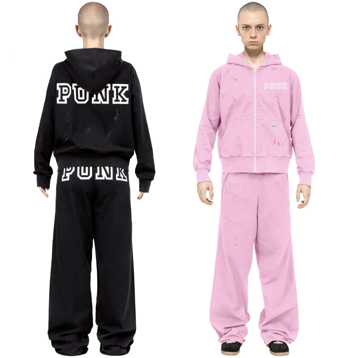
Tribute Brand's logo flipped PINK tracksuit / Source
But, I think that logo flipping is lazy. Or maybe, the better take is, logo flipping had to happen; the recognizable symbols of our Gen Z childhood had to be hacked and repurposed because, it’s inevitable; it’s just how the story goes. But can it be over? Isn’t there a brand that achieves the nostalgia of Jersey Shore motorcycle chic in a truly novel and modern way?
The answer is yes, but the brand is probably not doing it intentionally.
History
American Fighter was conceived in 2004 by MMA fighter Rich Franklin and Ohio karate school owner Jeff Adler. According to a 2009 MMA Junkie article, the duo (admittedly, and seemingly, with a lot of pride) created the brand to pay homage to one of their all-time favorite guy movies, American Pie. Their inspiration is most obvious in the company’s “American” namesake and in their company’s original (and since defunct) logo. Both it and American Pie use the same red rubber stamp template with all caps text. (It should also be noted that the Jersey Shore logo follows the same format, although it’s supposed to look more like a state license plate.
The evolution of the logos in question.
Other than awesome bro-ness, American Fighter’s initial business model in 2009 involved signing a licensing agreement with “high-end stores” like Buckle, Macy’s and Dillard’s, according to a 2011 Dayton Daily News article.
American Fighter also opened “branded gyms” in Long Island, NY and Fort Lauderdale, FL. Equipment like bags, mitts and gloves were American Fighter made; the logo was plastered across anything padded and sweaty in these pseudo-dojos, covering all sections of PU leather possible.
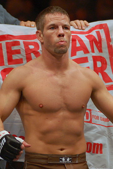
MMA and UFC fighters were also sponsored by American Fighter. In battle, they wore shorts with the company’s name on their behind, becoming living, breathing, bleeding symbols of its brand slogan, D is for DAMAGE.
American Fighter fighter Marcus Davis in 2008 / Source
Fellow MMA brand Affliction similarly sponsored early fighters and events, like the largely successful Affliction: Day of Reckoning. However, Affliction is far from a competitor brand as American Fighter is a trademark listed under the hilariously official sounding Affliction Holdings LLC. The big fish swallowed its underling back in 2008, a year before the brand’s official launch.
In the modern day, brands and designers like Anthony Riddle have riffed on the tradition of sponsoring MMA fighters, using the sport’s rough, raw and masculine optics to either aid or subvert their clothing’s cultural capital. Riddle, however, (although unconfirmed) probably doesn’t want to be swallowed by a bigger fish (unless it’s a big pay day?).
Anyway, over the past decade, American Fighter has undergone a rebranding, seen blatantly in its modern logo which ditches the rubber stamp and now resembles an aviation symbol. It’s less trashy and more classy, representing patriotism and limning the organized strength of a military group; displayed best by its combination of “A” and “F” symbols (so straight, and restrained). It genuinely reads “FAF” when observed closer.
American Fighter logo in 2024 / Source
However, it wasn’t always like that.
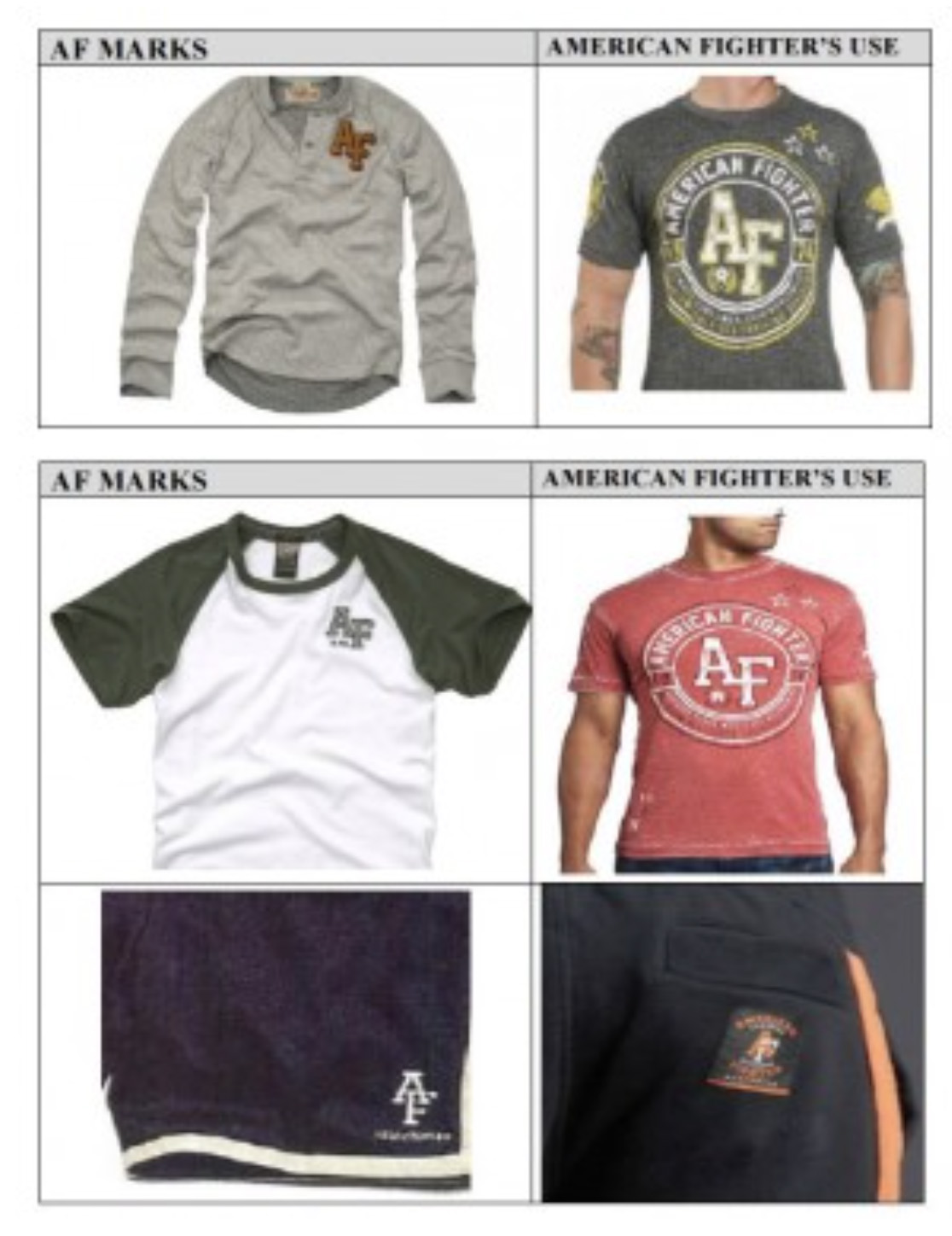
In 2014, Affliction Holdings was sued by Abercrombie & Fitch for printing “A” and “F” on all its American Fighter clothing. The two letters appeared right next to each other, in various, stylized combinations, basically using, without thinking straight, the two most forbidden initials in the trademarking industry. (The resemblance is uncanny.)
The only image (blurry) I could get from a legal site / Source
A settlement between the two companies was never publicized but, likely to avoid poking the bear, Affliction added an extra F going forward, coming dangerously close to (what would literally be poking a bear) the Five Nights at Freddy’s acronym “FNaF.”
Design
And the clothes, much like their symbol, have also undergone a cultural restructuring. Right now, American Fighter designs are always polygonal emblems, riffing on so-called “sacred geometry” commonly seen on EDM album covers and the arms and shoulders of your friend's molly-fried millennial sister (example here). The riff, though, that American Fighter’s design team cooked up (which came at a time when these sacred designs were popular, sometime in the mid-2010s), was transforming these otherwise super pussy spiritual shapes into the masculine accents of bodies stuck living in the time of clean lines that don’t intersect.
American Fighter then (by virtue of aesthetics) established itself as the modernist reductionist version of Affliction. They de-serifed 2000s motorcycle chic, evolving by flattening the tattoo-like, Gothic designs so popular among UFC fanatics; all the while, maintaining the rhythm of such designs; they’re still busy and chaotic but, when examined closer, everything is legible (there are no secrets); none of the lines even intersect; they just cut off before starting again, forming an illusion of flattened chaos.
A comparison is the phenomenon of logo simplification, which occurred over the same time period (the mid to late 2010s).
[image]
The end result is, like, a symbol you’d see on a hollowed out van in a shooting game or the rejected movie poster for Hunger Games: Mockingjay. Although both vapid examples (that describe almost corporate, auto-generated decision making), I think that American Fighter’s designs are beautiful. I can tell in their final production, that there was an almost Olympic-level mental gymnastics routine involved in producing it. It’s like listening to Taylor Swift because you appreciate all of the cogs in the system, the checks and balances, the elite decision-making that churned out the final, mass-marketed result. But American Fighter is not Taylor Swift. American Fighter is more like, Jelly Roll.
Reputation
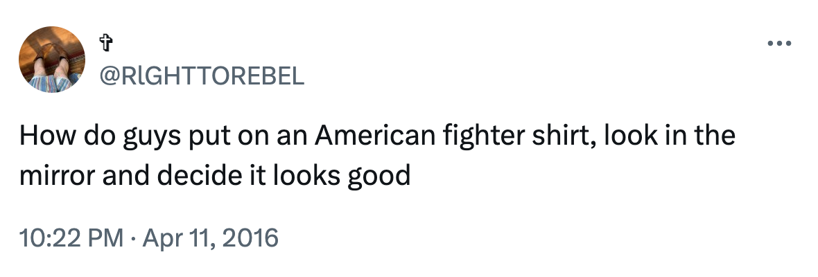
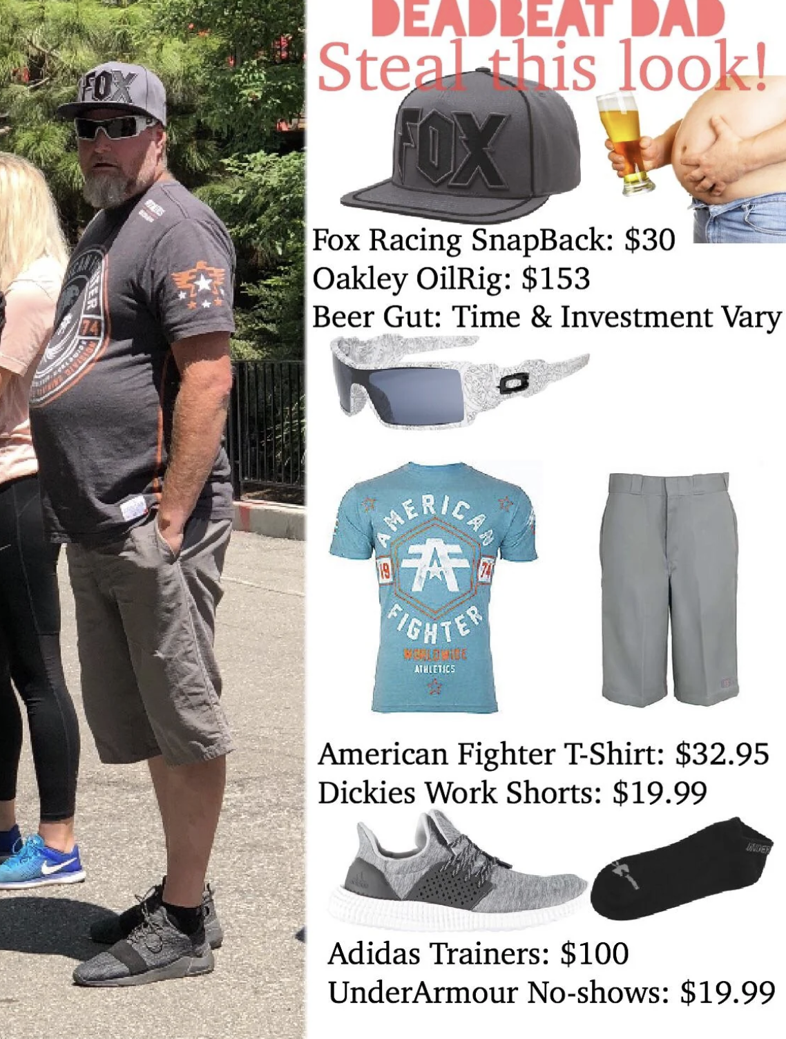
American Fighter shirts saturated the wild populous by 2016, and their street cred was not great right away. Tweet after tweet bashes the hilarious people spotted in these neon, almost Walmart Minecraft shirt-like fabrics. Per these early records, the American Fighter customer base consisted of tough (but, of course, not so tough) men: weaklings turned brave through the osmosis of their t-shirts. With a pair of Buckle jeans to pair, these men are (un)stoppable.
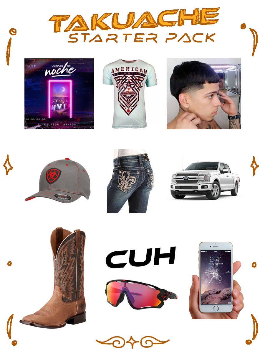
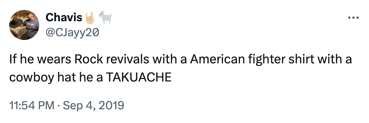
However, if that man is (instead) donning a pair of Rock Revival jeans, then you’re probably outside of the Walmart (rather than in it) watching takuaches in the parking lot cruising around in their lowrider cars. These Latino dudes occupy another niche of early American Fighter adopters, sporting Edgar cuts accented by Rancho Semental trucker hats; or at least, this is what the memes purport.
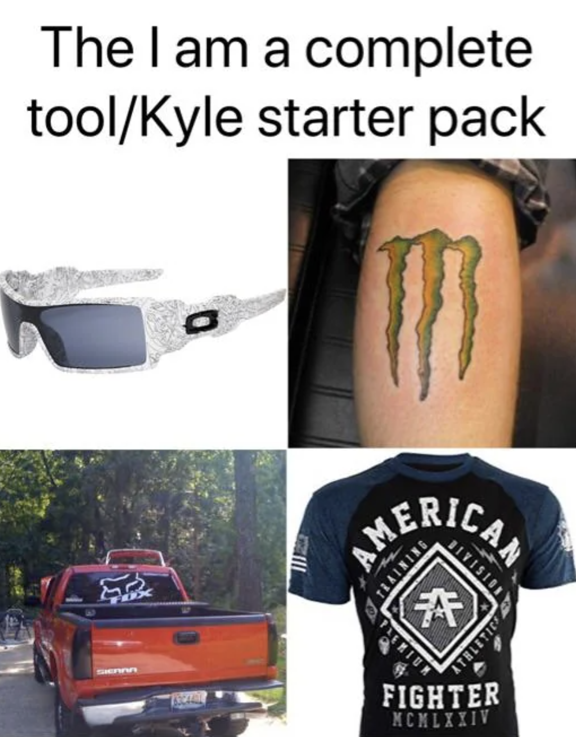
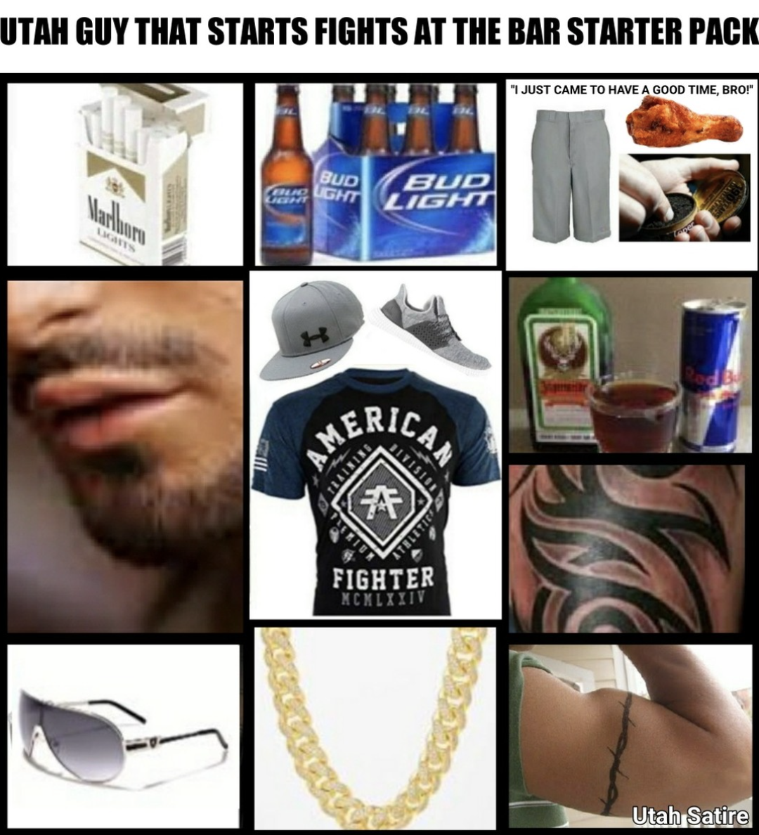
Ahh, Starter Pack memes. They’re a timeless format in fashion circles, as they’re easy to make and even easier to digest. Meme creators, who are not that creative, can take part in this evergreen Starter Park format that acts as a modern normie’s norm-codifying system of stereotypes and clowns; all they need is one app and a couple of PNGs. Starter Packs make a key, firsthand document of the layman’s opinions, especially given the timeframe of American Fighter’s market saturation (which occurred at a very Reddit point in history).
I want you to think back to that American Fighter and Rock Revival jeans combo… If I wore that today… And somebody from Texas saw me… They would think… What would they think? Would they identify me as an indie sleazeball? Or… would they clock me as a wannabe takuache put into a Kyle’s body?
Let’s measure the opposite… What if somebody, with no knowledge of the brand American Fighter, or Rock Revival, identified me walking passed them in Brooklyn. What would they identify me as? The answer is: I probably wouldn’t be wearing American Fighter with Rock Revival jeans. It would be too on the nose.
I see young people walking around (all of the time) wearing the two most common and safe hipster uniforms. One subverts the normal clubgoers of the late 2000s and the other subverts the guys who fixes tires in rural Pennsylvania.
Let’s consider the first. I think y2k clothing is either dead or dying in forward-thinking sleazedom. It’s too reachable of an era to subvert. Snooki, Sammy, Vinny (or any random Karma patron), their bedazzled designer-made motorcycle shirts were a brilliant thing to queer in 2016, but to all of the consumers and designers who are still subverting these tropes, it’s time to stop. American Fighter is doing it better.
American Fighter is an aesthetic middle ground between the emblazoned, full-scale, Gothic graphics of moto-chic and the graphic sterilization akin to the late 2010s. American Fighter has legacy as well because it’s directly associated with Affliction. Why keep subverting the original when you can hack its disciple? This will further hack the original and portray the modern American Fighter wearer’s keen awareness that the new is coming, and it’s hilarious to wear.
So, the reason why I wouldn’t wear an AF shirt with Rock Revival jeans is because, I don’t want the Revivals to revive any hope of a y2k moto look. I’d rather wear, like, Superdry® shorts on the bottom. I’d wear, like those short, polyester Superdry® shorts (that are almost like swim shorts, with that short-short look that’s so popular among straight men right now) that have the big “®” included on their graphic. (They include that big “®” like it’s their logo or something. You forget, for a moment (maybe years), that it’s a trademark symbol.)
(Forget it. Maybe a piece on Superdry® will be my next venture.)
Anyway, going back to the “two most common, safest hipster uniforms” the other is that Real Tree camo look. It’s a hunters uniform, with bright hi-vi orange, that lefties highjacked in the late 2010s. They’ve even held onto it through all of the Mossy Oak-wearing shooters in recent history.
It’s such bored look now as its the modern equivalent of an urban lumberjack. These modern urban hicks are just trying to queer middle Americans and Trumpers. It’s gotten so dead, that Presidential campaigns have even started to exploit it.
I need people to stop wearing Real Tree camo and reach for something more original from the upstate New Yorker treasure trove. American Fighter is a perfect choice.
Because, again, if anyone from Texas, or Utah, or Colorado, or anywhere else in the ether saw me sporting the most horrendously loud American Fighter top, they’d immediately associate me with their sister’s boyfriend who drinks too much beer when he goes to the rodeo, or Denny’s, or home, or school…This cliche is accessed more-so and taken-over better with American Fighter.
It’s very tiring to watch the constant onslaught of walking leaves at raves, delis and coffee shops. Like, yeah, it’s a safe choice to establish yourself as an irony-pilled Gen Zero attuned to the in-group, but there are so many hick aesthetics if you have the eyes to see them.
Lookbook
Here, now, is a shortlist of some American Fighter clothes I enjoy, in no particular order. I’ll tell you which one is my favorite though.
[insert slideshow]